
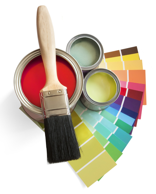
 When it comes to deciding on a paint color, many clients and friends tell us they are desperate for direction and are overwhelmed by all of the options available to them. We always tell them to relax and to not be afraid of color on the walls. To help all of you, here are some guidelines for picking a paint color with confidence and without regret.
Start with what you love.
Base your colors on the treasure trove of things within your sight. Let yourself be inspired by the colors in your favorite painting or the favorite items in your closet. When you’re outdoors, make note of the colors in nature that strike your fancy – the cool grey skies from winter, spring’s blooms, the green grass from summer and the russet tones of autumn leaves. In your home, there may be a cherished object from your last vacation or a rug that is your main reference point. As you take note of emerging patterns, it will be easier to select a color palette.
Set the scene.
There are a myriad of psychological studies that show that color generates emotions. When you pick a color for your room, consider the mood you want to convey. Do you want calm or lively? Do you prefer vintage or modern? Is the setting more formal or casual? Perhaps you want to add more drama or flair?
- Serene: Your home is your personal retreat. To bring a spa-like feel, apply warm creamy colors or cool pastel tones to your walls and ceilings.
- Lively: Wake up a room and enliven your environs with bright colors like warm oranges, buttery yellows, spicy reds and Mediterranean-inspired blues.
- Dramatic: Select rich dark colors like lush reds, deep purples and the daunting yet underused black (yes, we said it, black) to add an elegant yet bold flair. Metallic finishes work well to deliver immediate impact.
- Playful: Want a bit of whimsy? Create a spirited, light-hearted setting with vibrant colors or add contrasting tones for a more unconventional vibe. This is your opportunity to break with tradition.
Guiding Light.
Color reacts to light and changes how you see it. The light in a room and the paint’s finish, i.e., gloss, will impact how it looks in your room. Always consider these three elements: room direction, time of day and type of light when picking a paint color.
Direction: Your room’s exposure to sunlight from the north, south, east, or west impacts your perception of color on the walls. North-facing rooms get less direct and consistently cooler sunlight throughout the day. You can warm things up by painting the walls in warmer colors like shades of yellow, orange and red. Steer clear of whites in the North-facing rooms; the color will appear dull.
Southern-facing rooms are the sunniest place in your home. Colors are intensified in these rooms, so to create a calm and inviting ambience, select sandy hues and softer blue, green and yellow tones.
East-facing rooms get most light in the morning, and the light is more yellow. As the sun shifts, a warmer scheme is preferred to make up for the lack of natural light.
When the sun sets, rooms facing the west peak from the glow of the rays. Here’s where white stands out brilliantly, especially during daytime.
Timing: Colors look differently as the sun moves across the sky. Early morning light has a mixture of warm colors and gives paint a luminous glow. At the peak of sunlight, color has tendency to get washed out. By the end of the day, as the sun approaches the horizon, the light becomes warmer. You will want to assess your paint swatches at different points of the day: early morning, mid-morning, noon, late afternoon and sundown.
Artificial Light: Once you’ve examined natural light, you will have to consider how artificial light affects your walls. Thanks to many offerings in light bulbs, you can dictate the outcome of the paint color. For example, incandescent bulbs project warmer light that complements red, yellows and oranges. Cooler hues like blues and greens strengthen under fluorescent lighting. If you want something that most closely resembles daylight, then your best bet is halogen. Colors are amplified under their glow. LEDs are the front runner with most paint colors.
Test drive.
This is the most important tip we give to everyone. Before you commit to a color scheme, you need to see how it will look in the room. Paint retailers now sell sample sizes of most colors so taking this step is not a big investment. We recommend painting a sample board (paint stores sell these) with your favorite choices and take it into your room. Use painter’s tape to put it on the wall and see what you think. Observe how it works with light (natural and artificial) in the space and see if it complements your other décor elements. This is also your opportunity to take the sample board into adjoining rooms and see how the colors will flow from one room to the next. From here you should be able to pick your favorite color. Now use the rest of your sample paint to apply two coats in a large square to your wall. Again, live with this for a few days and see how it looks at different times of the day and with different light sources. If you weren’t able to pick only one color to sample on the wall, please don’t paint multiple colors side by side as they will interact with each other and will not give you a clear sense of how they will appear in the room when on their own.
Ask the experts.
At Grace Thomas Designs, we know that color is the key to creating spaces that are functional and fabulous. It’s a balancing act working with new color, other design elements and light; however, you now have tools of the trade to make informed decisions and to step boldly into the world beyond beige and off-white. If you are still unsure about the color schemes that are right for you, or you need some additional help pulling it all together, let’s talk. We are always here to help you make your home functional and fabulous!
My husband and I have hired a professional to paint our home, but we are stuck on what color we should ask them to paint it! We can’t agree on what looks best in our home. However, after reading this, I think we have a much better idea of what would work the best. I hope that other people will be able to read this and understand what will be best for them as well. Thanks for sharing this information.